Creating a combination chart to display respondent means as points and bars
You can create a combination chart to compare the means of groups of respondents in a satisfaction survey with the mean responses of all respondents.
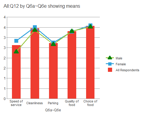
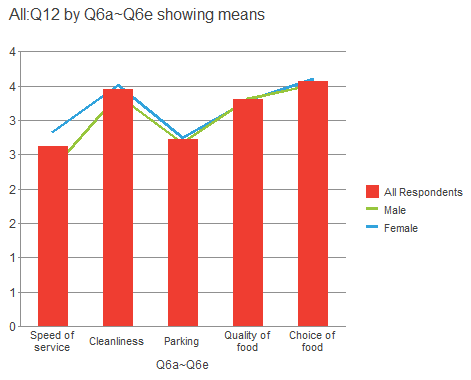
This example uses the data provided in the Crocodile Rock Cafe survey supplied with Snap XMP Desktop to display the average satisfaction for men and women at the Crocodile Rock Cafe against the average satisfaction of all respondents. To make it obvious which the reference values are, they will be displayed as bars, whereas the individual means for men and women will be displayed as points.
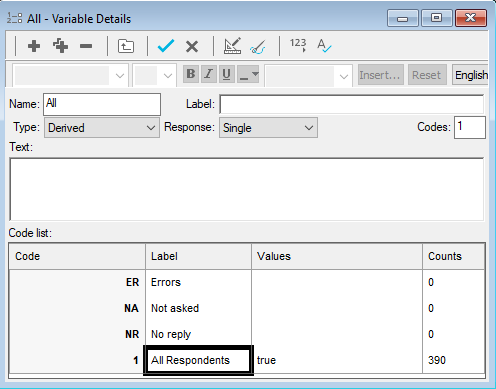
These instructions assume that you have created a derived variable that includes all respondents.
-
Click
 to open the Analysis Definition dialog.
- Change the Chart style to Bar counts.
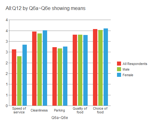
- Set the Analysis field to Q6a~Q6e. This includes all the satisfaction questions (you can check what they are in the open Variables window).
- Set the Break field to V1: Q10. (V1 is your newly created derived variable, Q10 is the gender question.)
- Set the Calculate field to Means & Differences.
- Check the Transpose box under Options.
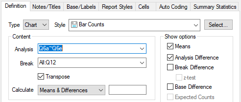
- Click OK. The chart window opens, displaying the defined bar chart.
- Open the chart designer by clicking
 on the chart toolbar. The chart designer dialog appears.
 - Highlight Chart in the left-hand pane if it not already selected. This is the section of the chart designer that defines the overall look of the chart.
- Ensure that the 2D radio button is selected and click Combination in the list of chart types.
- Click Apply to use these settings without closing the chart designer window.
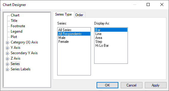
- Select Series in the left-hand pane. This is the section of the chart designer dialog that deals with the display of the break and analysis data. This is where you specify that in the combination chart, you wish to display the All Respondents information as bars, and the data split by gender as lines.
- Click All Respondents in the Series box and check that Bar is selected in the Display As box.
- Select Male in the Series box and select Line in the Display As box, and repeat for Female.
- Click Apply to use these settings without closing the chart designer window.
- The visible chart should change to show a combination bar and line chart.
- The bars are in front of the lines, making it difficult to see them. Select Series in the left-hand pan again, and click the Order tab.
- Select All in the list and click the Down button twice to move it to behind the Male and Female displays.
- Click Apply. The chart updates to place the lines in front of the bars.
Set the data point markers
Now you have created a combination chart, you want to mark the points that represent the data values for men and women, instead of just having them as points where the lines angle.
-
Click the
 by Series in the left-hand pane to show the list of the variable codes in the Break.
-
Click the
 by Male or Female to show the list of controls for displaying the information for the selected data. Select Datapoint Defaults. This is where you specify how the datapoints will be displayed.
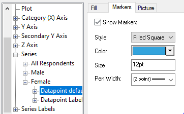
- Click the Markers tab to define the markers. (You can specify the line colour in the Fill tab.)
- Check the Show markers box.
- Set the Style as required. Here we have chosen Filled Square for Female and Filled Triangle for Male
- Leave the Color, Size and Pen Width as they are.
- Click Apply to update the chart.